Thrive Architect is a powerful WordPress page builder designed to help you create visually appealing and high-converting websites without extensive coding knowledge. In this complete guide, discover how Thrive Architect works, its key features, responsive design options, landing page templates, lead-generation tools, CTA optimization, SEO considerations, pricing, pros and cons, and practical tips for building conversion-focused websites. Whether you’re a beginner, marketer, blogger, or business owner, learn how Thrive Architect can help you create professional WordPress pages that turn visitors into leads and customers.
Table of Contents
- What Is Thrive Architect?
- Why Thrive Architect Is Built for Conversions
- Key Features of Thrive Architect
- Building Your First Page
- Designing High-Converting CTAs
- Using Lead Generation Elements
- Responsive Design With Thrive Architect
- Templates, Symbols, and Reusable Designs
- Custom HTML and CSS
- Thrive Architect Pricing and Value
- SEO Considerations
- Common Mistakes to Avoid
- Thrive Architect vs. Traditional WordPress Editing
- Tips for Improving Conversion Rates
- Who Should Use Thrive Architect?
- Pros and Cons
- Conclusion
- FAQs
What Is Thrive Architect?
Thrive Architect is a visual WordPress page builder designed around website creation, landing pages, marketing pages, and conversion-focused experiences. Instead of requiring you to build a page primarily through the standard WordPress editor or write code for every visual adjustment, it gives you a visual canvas where elements can be added, positioned, styled, and edited directly. Thrive Themes currently describes Architect as a WordPress landing-page and content builder aimed at marketers, and its documentation organizes the product around areas such as landing-page design, text and media, layout, lead generation, integrations, interactive elements, navigation, and advanced functionality.
The important distinction is that a high-converting website needs more than attractive colors and polished typography. A visitor should understand what you offer, why it matters, what action you want them to take, and why they should trust you—all without having to work too hard to find the answers. That is where a conversion-oriented builder becomes useful. Think of your website as a salesperson working around the clock: the design is its appearance, the copy is its conversation, the layout is its sales process, and the call to action is the handshake that moves the visitor forward. Thrive Architect gives you visual control over those pieces so you can shape a page around a specific business objective rather than simply decorating a blank canvas.
How Thrive Architect Works
The basic workflow is straightforward. You open a compatible WordPress page or post in the Thrive Architect editor, select the element you want to add, and use the visual editing interface to position and customize it. Thrive’s current documentation explains that elements can be dragged from the element panel onto the canvas, while selected elements expose their relevant styling and layout options. You can also select multiple elements, move them together, apply styling to groups, duplicate elements, and copy styles between compatible elements.
This matters because building a conversion page often involves repeated visual decisions. You may want several buttons to share the same appearance, multiple content boxes to use consistent spacing, or several sections to follow the same visual rhythm. Instead of repeatedly rebuilding those components from scratch, Thrive Architect gives you mechanisms for duplication, reusable templates, and symbols. The result is a workflow that can feel less like editing a document and more like assembling a visual system. Once that system is established, creating additional pages becomes faster and, just as importantly, more consistent.
Why Thrive Architect Is Built for Conversions
A beautiful website can still perform badly. Imagine a physical shop with an impressive entrance, expensive lighting, and stylish furniture—but customers cannot find the products, nobody explains the benefits, and there is no obvious checkout counter. The digital equivalent happens constantly: websites invest heavily in visual appearance while neglecting the journey from attention to interest to trust to action. Thrive Architect is positioned differently because its feature set includes marketing-oriented elements alongside conventional design controls. The official documentation includes dedicated categories for forms and lead generation, interactive and marketing elements, navigation, and integrations.
A conversion-focused approach starts by defining the action that matters. For an email newsletter, the goal may be an opt-in. For a service business, it may be a consultation request. For an online course, it might be enrollment. For an ecommerce-style offer, it could be a purchase or product-page click. Once that objective is clear, every major page component should support it. Your headline should attract the right audience, your supporting copy should remove uncertainty, your visuals should reinforce the message, your testimonials should establish credibility, and your CTA should make the next step obvious.
Design vs. Conversion-Focused Design
The difference between ordinary design and conversion-focused design is surprisingly simple: ordinary design asks whether a page looks good; conversion-focused design asks whether the page helps visitors make a decision. That does not mean aesthetics are irrelevant. In fact, visual quality strongly influences perceived credibility. The difference is that aesthetics become a tool rather than the final destination.
A strong landing page typically has a clear hierarchy. The visitor should immediately encounter a meaningful headline, understand the core benefit, see supporting information, encounter trust signals, and eventually reach a compelling call to action. Thrive Architect can support that structure through its visual layout controls and marketing-oriented elements. The builder does not magically create persuasive copy or guarantee conversions, of course. You still need a strong offer, accurate positioning, useful content, and a reason for visitors to act. What the tool provides is the flexibility to turn that strategy into an actual page without making every design change dependent on a developer.
Key Features of Thrive Architect
One of the biggest attractions of Thrive Architect is the breadth of control available within the visual editor. Current Thrive documentation covers elements for page and landing-page design, text and media, layouts, lead generation, navigation, styling, marketing interactions, integrations, and more. That breadth means the tool can be used for relatively simple pages as well as more sophisticated marketing experiences.
For a marketer, this creates an interesting advantage. You can move from strategy to implementation quickly: decide what the page needs, add the required sections, insert your messaging, style the components, check the responsive layouts, and publish. You are not locked into a rigid visual pattern simply because the default WordPress editor does not expose a particular design option. At the same time, the large number of available settings means beginners should resist the temptation to customize everything. Conversion-focused design often improves when you establish a small visual system—consistent fonts, colors, button styles, spacing, and content widths—and reuse it throughout the page.
Visual Drag-and-Drop Editing
The drag-and-drop workflow is one of the clearest reasons people choose a visual builder. Thrive’s documentation describes a workflow where you open the element panel, search or browse for the required element, and drag it onto the canvas. Once an element is selected, you can modify its positioning and styling from the editor, while frequently used elements can be pinned for quicker access.
This can significantly reduce the friction between having an idea and testing it. Suppose you want to move a CTA higher on a page, reduce the spacing beneath a headline, change a button’s width, or rearrange two content sections. In a conventional workflow, depending on the theme and implementation, that could require editing settings, custom CSS, blocks, or developer assistance. With a visual builder, you can make the adjustment while seeing the approximate result immediately. That speed is particularly valuable when you are experimenting with different layouts because conversion optimization is rarely about getting everything perfect on the first attempt.
Conversion Elements and Marketing Tools
Thrive Architect’s broader ecosystem includes tools and elements intended for lead generation and marketing workflows. The official documentation lists forms and lead-generation functionality among its major feature areas, while Thrive Automator can connect form submissions with other WordPress plugins and services. Its current integration documentation, for example, describes a form-submit trigger that can initiate actions such as sending notifications or connecting with other systems.
This creates an important distinction between a page builder and a broader marketing workflow. A button that looks attractive is only one part of the funnel. A visitor might click that button, submit information, receive an email, enter a course, or trigger another business process. When your design and automation layers work together, the page becomes part of a measurable customer journey rather than an isolated web page. For serious conversion work, that connection is often more valuable than another collection of decorative design options.
Building Your First Page
When creating your first Thrive Architect page, begin with the business goal rather than the editor. Before dragging a single element onto the screen, write down what you want the visitor to do. Then identify the minimum information they need to feel comfortable taking that action. This prevents one of the most common page-builder problems: starting with a blank canvas and filling it with every component that looks interesting until the page becomes visually crowded and strategically confusing.
A practical structure might include a hero section, problem or opportunity statement, benefits, proof, explanation of the offer, objection handling, another CTA, and a final reassurance section. You do not need every section on every page. A short campaign landing page might require only a hero, benefits, proof, form, and CTA. A long-form sales page may need considerably more. The correct structure depends on the complexity of the offer and the amount of trust required before someone acts.
Choosing a Page Structure
A good page structure follows the visitor’s questions. First: What is this? Second: Is it relevant to me? Third: Why should I believe you? Fourth: What exactly do I get? Fifth: What happens if I take the next step? Your sections should answer these questions in a natural order.
The visual editor makes it easy to add columns, content areas, buttons, images, and other elements, but that flexibility should be controlled by the customer journey. Use whitespace to separate ideas. Keep related information visually grouped. Make important CTAs recognizable without turning every button into an emergency alarm. When a page feels easy to scan, visitors can spend their attention on the offer instead of trying to decode the layout.
Creating a Strong Hero Section
The hero section is often the first serious test of your conversion strategy. A visitor should be able to identify the audience, offer, and primary benefit quickly. A weak headline says something vague such as “Welcome to Our Website,” while a stronger headline communicates a concrete outcome for a specific audience. The supporting text should clarify the promise rather than repeat it, and the primary CTA should tell the visitor exactly what happens next.
Your hero does not need to contain every piece of information. Its job is to earn enough attention to make the visitor continue. Use an image, illustration, video, or other visual only when it supports the message. If a visual distracts from the CTA or makes the section difficult to scan, it may be hurting more than helping. The best hero section is not necessarily the most dramatic one; it is the one that makes the next decision feel obvious.
Designing High-Converting CTAs
A call to action should be treated as a strategic component rather than a decorative button. “Submit” may technically describe an action, but it does not communicate value. Depending on the offer, language such as “Get the Free Guide,” “Book My Consultation,” “Start Learning,” or “See the Plans” can tell visitors more clearly what they receive after clicking. The exact wording should match the actual next step and should never promise something the following page or process does not deliver.
Placement matters as well. A long page should not force visitors to scroll all the way back to find the action. At the same time, repeating the same CTA after every paragraph can make the page feel aggressive. Instead, place CTAs at meaningful decision points: after the primary value proposition, after major proof or benefit sections, and near the end after objections have been addressed. Thrive Architect’s visual editing workflow makes these components easy to reposition and style, which is useful when refining a page after reviewing real user behavior.
Using Lead Generation Elements
Lead generation pages have one central challenge: asking for enough information to qualify a prospect without creating unnecessary friction. If someone only needs to receive a short ebook, asking for ten fields may be excessive. If you are qualifying a high-value B2B prospect, additional information may be justified. The right form length depends on the value of the exchange and the sales process that follows.
The visual design should make the form feel approachable. Explain what the visitor receives, make required information clear, and avoid clutter around the form. Trust indicators can help when appropriate, particularly when people are being asked to provide personal or business information. Once the form is submitted, the experience should continue logically: show a confirmation message or next step, deliver the promised resource, and connect the submission to the appropriate follow-up process.
Responsive Design With Thrive Architect
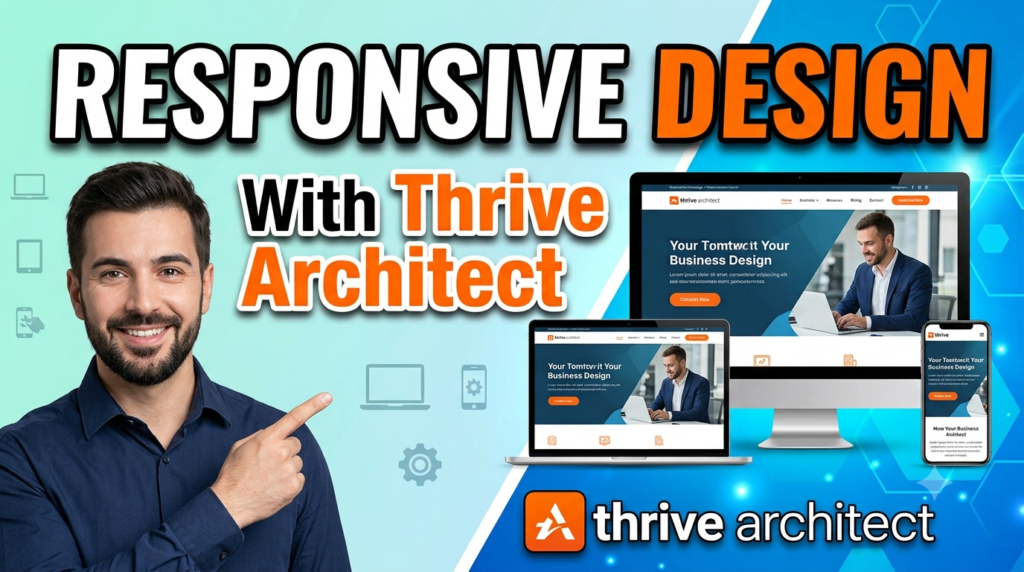
Responsive design is not an optional finishing touch anymore. A page can look exceptional on a large monitor and still provide a frustrating experience on a phone. Thrive Architect currently provides desktop, tablet, and mobile editing views, along with device-specific controls for properties such as typography, spacing, dimensions, alignment, backgrounds, visibility, and column behavior.
The editor uses a cascading approach, meaning changes made at larger breakpoints can flow down to smaller ones unless specific overrides are applied. This allows you to create a desktop foundation and then refine tablet and mobile presentations separately. It is especially useful for conversion pages because mobile users may need different spacing, button sizing, image treatment, or even simplified content. Thrive’s documentation also recommends checking the published page on an actual device because editor previews are approximations rather than perfect simulations of every mobile-browser behavior.
Mobile Optimization
Mobile optimization should begin with the most important conversion elements. Check the headline first. Is it too large? Does it create an awkward number of lines? Then check the CTA. Is it easy to tap? Does it remain visible and understandable? Next, inspect images, columns, forms, and spacing. A desktop layout that depends on several columns may need to stack vertically on a phone.
Pay special attention to horizontal overflow. Thrive’s troubleshooting documentation identifies oversized images, negative margins, fixed-width columns, long unbroken strings, and elements wider than their parent containers as common causes of mobile display problems. A page that forces visitors to scroll sideways is not simply unattractive—it creates friction precisely when you are asking someone to take an action. Test the actual published page, not just the editor preview, before considering the mobile experience finished.
Templates, Symbols, and Reusable Designs
Reusable designs can dramatically improve consistency and production speed. Thrive Architect supports saving content as templates or symbols, allowing frequently used structures to be reused instead of recreated. Its current documentation explains that symbols can remain globally linked, meaning changes to the linked symbol can affect its instances, while unlinking converts an instance into regular editable content.
For a business website, this can be extremely practical. You might create a standard CTA section, testimonial block, feature comparison area, or promotional banner and reuse it across multiple pages. Consistency then becomes easier to maintain. The key is to use global components intentionally. If a component contains information that must vary from page to page, a normal template or independent element may be safer than a globally linked symbol.
Custom HTML and CSS
You do not need to know code to use Thrive Architect effectively, but advanced users can go beyond the built-in controls. Thrive’s documentation explains that users can view and edit page HTML and add custom CSS to individual elements or pages. Custom classes can be assigned to elements and then targeted with CSS, while the Custom HTML element can accommodate HTML, JavaScript, shortcodes, iframes, and other code that the standard elements may not cover.
This flexibility is useful when you have a specific design requirement that the visual controls do not handle cleanly. However, custom code should not become the default solution for every small adjustment. Excessive custom CSS can make future maintenance harder, especially when several pages contain different overrides. Start with the native controls, use reusable styles where possible, and introduce custom code only when there is a clear reason.
Thrive Architect Pricing and Value
Pricing can change, so it is better to check the official Thrive Themes pricing page before purchasing rather than relying on an old review. At the time of the current search, Thrive’s official page displays multiple options, including Thrive Architect, Architect plus Optimize, and Thrive Suite. The displayed pricing also distinguishes introductory pricing from full renewal pricing, so buyers should pay attention to both the initial cost and renewal terms.
The question is therefore not simply whether Thrive Architect is cheap or expensive. The better question is whether its workflow and conversion-oriented functionality can save enough time or improve enough business outcomes to justify the investment. For someone building one basic brochure website, a simpler builder may be sufficient. For a marketer, agency, course creator, consultant, or business owner who regularly builds landing pages and conversion-focused campaigns, the broader feature set may provide considerably more value.
SEO Considerations
A page builder does not automatically make a website rank well in search engines. SEO still depends on content quality, search intent, technical health, site architecture, internal linking, performance, structured data where appropriate, and many other factors. Thrive Architect should therefore be viewed as the design and page-building layer rather than a replacement for a complete SEO strategy.
When creating an SEO-focused page, start with the searcher’s intent. Make the primary topic clear, use logical headings, answer the user’s questions thoroughly, and make the content easy to scan. Avoid designing pages that hide important information behind unnecessary interactions simply because they look modern. Search engines and visitors both benefit when valuable content is accessible and logically structured. Your conversion elements should support the content rather than make the page feel like an advertisement with little substance.
Common Mistakes to Avoid
The biggest mistake is confusing more design options with better design. A page builder gives you the ability to add gradients, animations, boxes, shadows, icons, columns, images, videos, and countless spacing adjustments. That does not mean your page needs all of them. Every visual element should have a job: explain, reassure, guide, demonstrate, or persuade. If it does none of those things, consider removing it.
Another common mistake is ignoring mobile until the very end. Responsive adjustments can affect spacing, typography, stacking, visibility, and image presentation, so mobile should be considered during the design process rather than treated as a last-minute repair. Thrive’s current responsive documentation specifically provides device-specific controls to make these adjustments, but it also recommends checking the final published page on real devices.
A third mistake is creating inconsistent CTAs. If one button says “Learn More,” another says “Get Started,” and another says “Buy Now,” visitors may not immediately understand whether these actions are different or simply different labels for the same step. Establish a clear hierarchy. Your primary conversion action should look and sound consistent throughout the page unless there is a genuine reason to introduce another action.
Thrive Architect vs. Traditional WordPress Editing
Traditional WordPress editing can be perfectly adequate for straightforward content publishing. If you are writing blog posts, adding simple images, or creating basic pages, you may not need an advanced visual builder. The difference becomes more noticeable when you need precise layouts, custom landing pages, conversion elements, reusable sections, or marketing-focused designs without repeatedly depending on code.
Thrive Architect essentially gives marketers more visual control over the page-building process. Its current documentation shows a broad ecosystem covering landing pages, layouts, lead generation, integrations, navigation, styling, interactive elements, and troubleshooting. The trade-off is that more flexibility means more decisions. A beginner can easily spend hours adjusting tiny details that have little impact on actual results. The best approach is to use the flexibility to support a clear strategy rather than allowing the editor to become the strategy.
Tips for Improving Conversion Rates
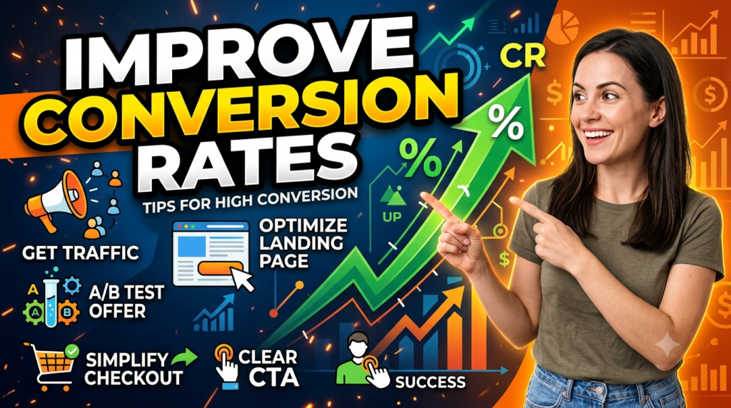
Start with your offer, not your colors. A weak offer cannot be rescued by a beautiful page. Once the offer is strong, clarify the headline, remove unnecessary distractions, strengthen your proof, make the CTA specific, simplify forms, and make the mobile experience frictionless. Then measure what happens and improve the weakest part of the journey.
Testing should be systematic. Change one meaningful variable at a time when possible, such as the headline, CTA wording, form length, pricing presentation, or hero structure. Do not judge success solely by clicks; the ultimate metric should reflect the business outcome you care about. A button that receives more clicks is not necessarily better if those clicks produce fewer qualified leads or customers.
Reusable design systems can also improve your optimization process. If your buttons, sections, and content structures are consistent, you can focus on testing the message and offer rather than rebuilding the visual foundation every time. Thrive Architect’s support for reusable templates and symbols can contribute to that workflow.
Read More:-
Parcel ABC UK Shipping Guide: Features, Pricing, and Benefits Explained
Why Fun-sport-vision.com DE Is Gaining Popularity in Germany
Mashvisor (US): Complete Review for Real Estate Investors in 2026
What Is Scandic SE? A Complete Beginner’s Guide
Simpel NL Explained: Everything You Need to Know
Who Should Use Thrive Architect?
Thrive Architect can be a strong fit for WordPress marketers, bloggers, consultants, coaches, agencies, course creators, service businesses, and entrepreneurs who want more control over landing pages and conversion-focused content. It is particularly useful when you expect to create multiple campaign pages rather than simply maintaining a small informational website. The visual workflow can also appeal to people who understand marketing but do not want every page adjustment to require coding.
It may be less compelling for someone who wants the simplest possible WordPress editing experience. If your website consists mainly of standard blog posts and a few basic pages, a lighter approach may be enough. Similarly, if your business requires highly specialized application functionality, a page builder alone will not solve those requirements. The right choice depends on how central landing pages, marketing funnels, and visual control are to your website strategy.
Pros and Cons
| Area | Pros | Cons |
| Visual editing | Direct, visual control over page elements | Large number of options can feel overwhelming |
| Conversion design | Strong focus on marketing and landing-page workflows | Results still depend on offer, copy, and strategy |
| Responsive design | Desktop, tablet, and mobile controls | Final pages should still be tested on real devices |
| Reusable content | Templates and symbols can improve consistency | Global symbols require careful management |
| Customization | HTML and CSS options are available | Advanced customization may require technical knowledge |
| Marketing workflows | Supports lead-generation-oriented elements and integrations | Some advanced workflows may involve additional Thrive products or services |
| WordPress | Designed specifically for WordPress | Not intended as a general standalone website platform |




Conclusion
Thrive Architect is more than a visual page builder when it is used correctly—it can become part of a conversion-focused website-building system. Its value comes from combining visual editing with marketing-oriented elements, responsive controls, reusable designs, and advanced customization options. Current Thrive documentation confirms that the editor supports drag-and-drop content creation, device-specific responsive editing, reusable templates and symbols, and advanced HTML/CSS customization.
The most important lesson, however, is that software does not create conversions by itself. A high-converting website begins with a clear audience, a compelling offer, useful content, credible proof, and a logical customer journey. Thrive Architect gives you the tools to express that strategy visually and iterate without constantly rebuilding the site from scratch. If you treat every section as part of the visitor’s decision-making process—and continually test, simplify, and improve the experience—you can turn the flexibility of Thrive Architect into a genuine business advantage.
FAQs
Q. Is Thrive Architect good for beginners?
A. Yes, especially for beginners who prefer visual editing over coding. The drag-and-drop workflow allows users to add elements directly to a page and customize them through the visual interface. However, beginners should start with simple layouts rather than trying to use every available feature immediately. Learning basic principles of hierarchy, spacing, typography, CTA placement, and conversion copy will make the builder much easier to use effectively.
Q. Can Thrive Architect create landing pages?
A. Yes. Landing-page design is one of the core areas supported by Thrive Architect. Thrive’s official documentation includes dedicated landing-page resources, and its product page currently advertises more than 220 landing-page templates across the listed Architect-related offerings. The visual editor can then be used to customize the structure, content, styling, and responsive presentation for your campaign.
Q. Does Thrive Architect work on mobile devices?
A. Yes. Thrive Architect provides desktop, tablet, and mobile editing modes, including responsive controls for typography, spacing, layout, visibility, backgrounds, and other properties. It is still important to test the published page on actual phones because editor previews cannot perfectly reproduce every mobile-browser behavior.
Q. Do I need coding knowledge to use Thrive Architect?
A. No. Most everyday page-building tasks can be completed through the visual editor. Thrive also provides advanced HTML and CSS functionality for users who need additional customization, but its documentation specifically describes these as advanced capabilities. If you are comfortable with HTML or CSS, those features can extend what you can accomplish; if you are not, you can still build pages using the standard visual controls.
Q. Is Thrive Architect worth it for a business website?
A. It can be, particularly if landing pages, lead generation, marketing campaigns, and conversion optimization are important parts of your website strategy. The value depends on how much you will use its capabilities and whether the workflow saves you time or supports better marketing execution. Before purchasing, check the current official pricing and renewal terms because Thrive’s pricing and package structure can change over time.